 PARAMETRE
Colour grading: why it changes everything in a packshot
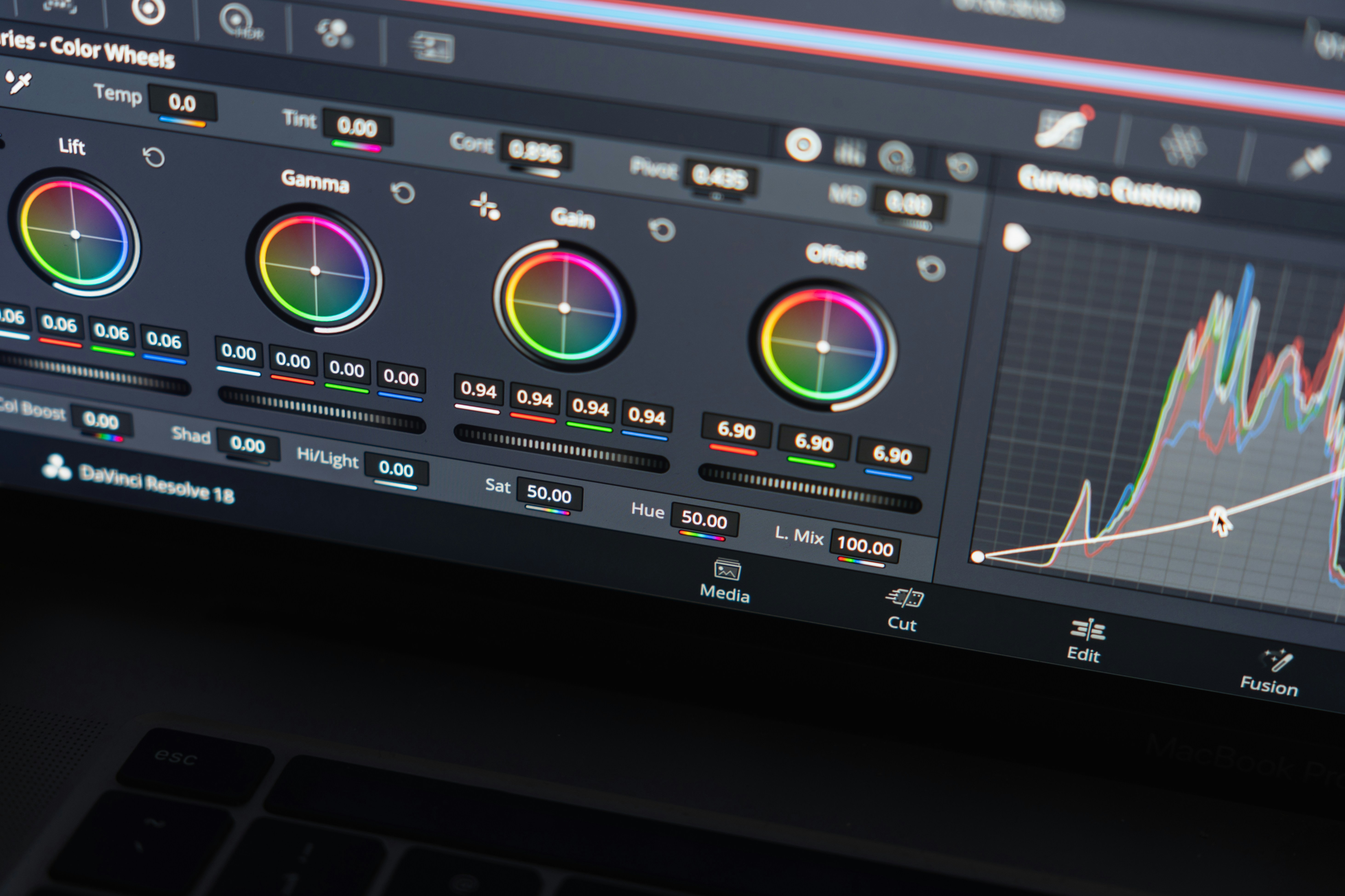
Colour grading is often the last step in a production, but it is also the one that makes the difference between a correct visual and one that leaves a mark. In the beauty and luxury sector, where every colour nuance can carry a precise meaning, it is a step we never treat lightly.
What colour grading really is
Colour grading is the art of giving an image a colorimetric intention. It is not retouching in the traditional sense. It is an artistic decision: what light temperature? What contrasts? What saturation for skin tones, for reds, for whites? The same packshot processed by two different colourists can produce radically different results, and both can be technically correct. The difference lies in the artistic direction.
Why it is decisive in beauty
In the beauty sector, colour is never neutral. A lip colour that appears slightly too orange rather than red, a foundation that reads too pink rather than beige, a skincare product whose packaging loses its distinctive tone: these small deviations can have major consequences on the brand's image and on consumer purchasing decisions.
Colour grading ensures that what is shown on screen, on e-commerce sites and in print matches what the product actually is. It is both a technical guarantee and an artistic act.
CGI and colour grading: a natural pair
In CGI production, colour grading takes on a particular dimension. The 3D render produces a neutral, technically correct image, but one that has not yet received its artistic treatment. It is during grading that the image truly comes alive, that the warm atmosphere or clinical coolness of a premium skincare visual takes shape, that the dramatic contrast of a perfume campaign is established.

Consistency across all formats
One of the most important roles of colour grading in a beauty production is ensuring visual consistency across all formats and all media. A packshot that appears on a white e-commerce background, in a dark magazine spread and on a coloured social media feed must retain its integrity in all three contexts. This requires very precise technical calibration work, which is part of the grading process.
Colour grading is not the finishing touch you add at the end when everything else is done. It is an integral part of the creative vision, one that deserves to be considered from the brief stage. When it is treated with the level of care it deserves, it is often what makes a visual truly unforgettable.
Would you like to talk about the colour treatment of your visuals?
Get in touch →